When England’s second national lockdown ends on Wednesday, some 23 million people will find themselves in Tier 3 – the toughest level of restriction – with a further 32 million in Tier 2.
It’s fair to say there’s been some anger about the decision, with one bar-chain owner describing the new rules as a “mortal blow” to his industry and up to 70 Conservative backbenchers reportedly threatening to rebel or abstain on next week’s Parliamentary vote.
The crux of the complaint from many MPs is that they don’t think the coronavirus risk in their area warrants being put under tougher restrictions, with all the economic and social damage that entails.
So how does the government decide which areas of England will go into which Tier? And can we tell if any local authorities have been treated unfairly?
Let’s take a look at what we know.
Five criteria
Matt Hancock told MPs yesterday that the decisions “have been made according to the best clinical advice, and the criteria that we set out in the COVID-19 Winter Plan.”
Those are: “case detection rates in all age groups, case detection rates in the over 60s, the rate at which cases are rising or falling, positivity rate (the number of positive cases detected as a percentage of tests taken), pressure on the NHS”.
Changing fortunes
And it’s not just about absolute numbers – the government also takes account of whether there’s been a change in any of the indicators.
This graph from Public Health England looks at one of the five indicators. It plots cases per 100,000 people in the week ending 19 November (along the bottom) against the equivalent figure for the previous week up the side (y) axis.
PHE says: “Bubbles above the diagonal dotted line show areas that have experienced a fall in their case rate over the past week.” Conversely, those below the dotted line have seen an uptick.
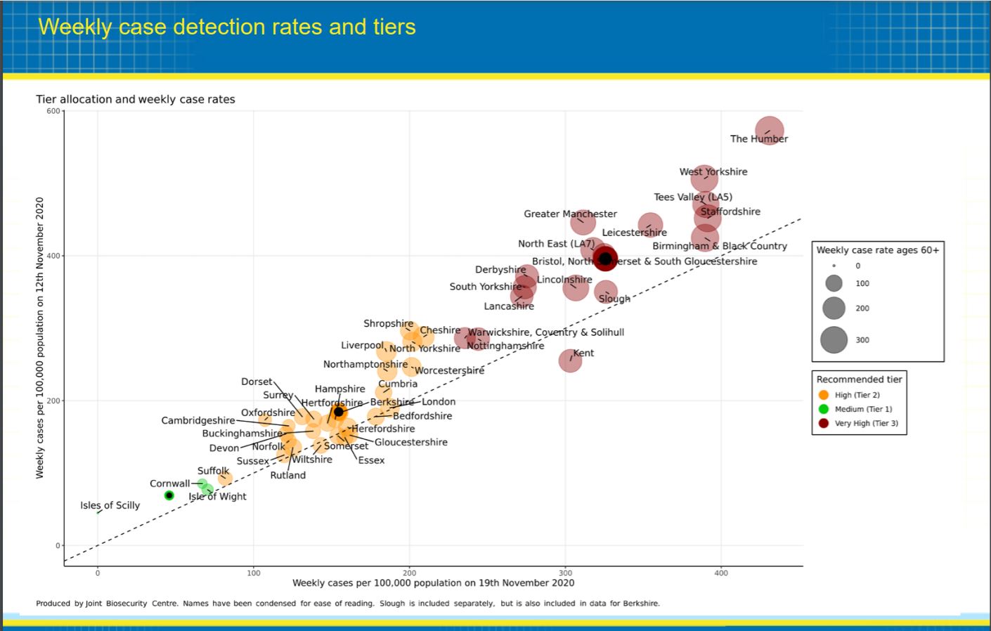
This goes some way to explaining why Kent is in Tier 3, despite having fewer cases per capita than places like Cheshire and Shropshire, which are in Tier 2. (Though it’s only one indicator and not always directly comparable between areas).
But while the graph seems to resolve one question, it raises another: why are so many parts of the North still in the top Tier if their case rates are falling?
The PHE analysis says: “This chart shows some decreases in weekly case rates in the north of England, and other areas where case rates are high but declining. Continued improvement over the coming period may make these areas candidates for de-escalation in the New Year”.
Unfair treatment?
So now we know this, can we work out whether any areas have been badly treated (or unfairly protected) by the latest announcement?
This analysis from the Financial Times has a go at the answer. It concludes that overall, Tiers are “correct” in most places, but suggests that some areas, like Stratford-upon-Avon, might have been treated more harshly than those in similar Covid situations. At the same time, it indicates boroughs in outer London might have been “let off”.
Though there are some important caveats. The FT assessment “weights” each of the five factors equally, but as the analysts themselves acknowledge, the government does not.
The Department of Health’s Winter Plan says: “The Government will need to maintain some flexibility to weight these indicators against each other as the context demands. For example, hospital capacity in a given area will need to be considered in the light of the capacity in neighbouring areas and the feasibility of moving patients. Case detection rates will need to be weighted against whether the spread of the virus appears to be localised to particular communities”.
Matt Hancock set out some detail yesterday on how different parts of England have been allocated their Tiers. It’s clear from the account he gives that certain factors weigh more heavily in some areas than in others.
We asked the Department of Health whether they would release more precise numerical data on weightings, which would allow us to replicate their calculations. They’ve yet to say if they’ll publish the information.
Other factors?
The government’s Winter Plan indicates that there might be more factors in play than the listed criteria, stating that Tiering decisions will be based only “primarily” on the five named indicators. And Matt Hancock gave himself some wiggle room when he referred to the “best clinical advice” sitting alongside the measures.
Back in October, the Department of Health gave FactCheck a list of eleven different datasets that formed part of its calculations.
These were: “the number of patients in hospital with coronavirus, seroprevalence, modelling data, ONS and React surveillance data, positivity rates and NHS indicators such as GP attendance, calls to the NHS 111 service and hospital admissions.”
(“Seroprevalence” is when the government analyses blood samples from donors to calculate how many people might have had coronavirus without any symptoms. “React surveillance data” comes from a major study by Imperial).
Six out of the eleven indicators are not included in the most recent list of official criteria, but as we’ve seen, those latest lists are not exhaustive. The Department of Health hasn’t confirmed whether any of these six are still included in the government’s calculations.
FactCheck verdict
The government says it decides which areas of England go into which Tiers “primarily” on the basis of five criteria: “case detection rates in all age groups, case detection rates in the over 60s, the rate at which cases are rising or falling, positivity rate (the number of positive cases detected as a percentage of tests taken), pressure on the NHS”.
This gives us some useful insight into what’s hitherto been an opaque process. One analysis using these measures finds that for the most part, areas have been sorted into the “correct” Tier, though it gestures towards possible outliers.
But there are still gaps in our knowledge. We don’t know how much weight each of the five factors is given in the Tiering decision. Indeed, the government has said that in some areas, certain indicators will bear more heavily on the outcome than they would in other parts of the country.
There are sound reasons for this (local authorities face unique circumstances which would be wrongly flattened out by a one-size-fits-all approach), and Matt Hancock has set out some detail for MPs. But we haven’t yet got a numerical account of how each factor is weighted in each area, which would allow us to do a more precise analysis.
We also have reason to believe that factors other than the five listed form part of the calculation. In October, we heard about six other indicators, but the government is yet to tell us whether these are still in play.


