Why don’t the Paralympics use the Olympic rings?
Would you recognise the Paralympics logo, called Agitos? Ahead of the start of next week’s Games, it is on display at Tower Bridge, but why is it so different from the familiar five Olympic rings?
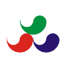
Unveiled in 2004, the current Paralympic logo was designed to reflect the four core values of the Paralympics: courage, determination, inspiration and equality.
The Paralympic symbol (three Agitos) consists of three elements in red, blue and green – the three colours that are most widely represented in national flags around the world.
The three Agitos, from the Latin meaning “I move”, surrounds a central point symbolising motion, and emphasises the role of the Paralympic movement in bringing athletes together from all corners of the world to compete.
The logo will be displayed at Tower Bridge until 15 September and is also displayed at the Olympic Village as the Games gear up for the 28 August start.
A Paralympic spokesman said: “The symbol also reflects the Paralympic motto, “Spirit in Motion,” representing the strong will of every Paralympian.
“The Paralympic symbol also emphasises the fact that Paralympic athletes are constantly inspiring and exciting the world with their performances: always moving forward and never giving up.”

Olympic friction
Despite its noble ideals of unity in sporting endeavour, the Olympic movement is not shy when it comes to protecting its brand image. The original Paralympics logo was abandoned nine years ago after being deemed too similar to the Olympic rings.
First used at the summer Paralympic Games in Seoul in 1988, the original symbol was based on the traditional Korean decorative component called tae-geuk . According to oriental philosophy, tae-geuk refers to the ultimate reality from which all things and values originate.
But the use of five tae-geuks in an arrangement of positions and colours bearing a more than passing resemblance to the Olympic rings, drew objections from the International Olympic Committee, and in 2003 Paralympic organisers decided on the Agitos symbol as a replacement.