The Institute for Fiscal Studies (IFS) says the average household is £1,127 a year worse off thanks to tax and benefit changes introduced by the coalition.
But government figures say families have gained very slightly from its policies, even after five years of austerity, with the richest paying by far the most towards cutting the deficit.
Real earnings have also fallen, and spending on public services have fallen. Are you out of pocket thanks to coalition policies, and would it have been any different under a Labour government?
A tale of two graphs
This is the Treasury analysis of how all changes to the tax and benefits system introduced after the May 2010 election.
There are a few different ways you can look at this – like ranking households by how much money they spend instead of income, and talking about percentage of income rather than cash – but the basic story is the same:
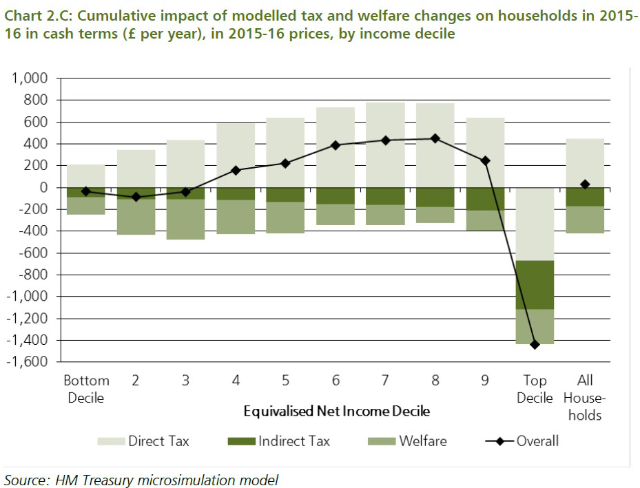
The lowest earners have seen little change, perhaps losing out a little, whereas people in the middle or upper-middle income bands have done quite well. The richest 10 per cent have borne the biggest brunt.
Here’s the IFS’s version of events:

Now almost everyone has lost out. Instead of hovering just below the zero line, the poorest are down to the tune of several hundreds of pounds, and the top 10 per cent are losing more than £2,000 a year.
The basic pattern – the shape of the curve – is the same: middle earners have done better than low earners, and the very richest have taken the biggest hit.
But the actual numbers are wildly different. The IFS says the average household has lost £1,127 a year thanks to coalition policies. The government says there is a tiny net gain across all households.
The difference is that the IFS includes a lot of policies that the Treasury doesn’t, including restrictions on tax relief on pension and changes to contributions.
And the IFS model is based on a hypothetical situation where everyone claims all the benefits available to them, whereas the government takes into account the incomplete take-up of benefits. This is arguably more realistic, and is one reason why government data shows smaller losses for low-income groups.
As well as identifying much bigger cash losses for everyone, the IFS analysis weakens the government’s claim to be hitting the highest earners the hardest.
There’s no dispute that the richest 10 per cent are biggest cash losers (the black line in the IFS graph), but the big thing about being rich is that you have more money to start with, so you won’t feel the pinch as much.
That’s why we measure gains and losses as a percentage of income instead, which changes the picture dramatically. Look at the light grey line in the IFS graph: as a percentage of net income, it’s the lowest earners who are losing the most.
Mr Average
All these studies are based on a notional average household, which of course doesn’t really exist. The IFS goes into a lot of detail on how it thinks tax and benefit changes have affected different kinds of people, which tells us a lot about who has been protected the most from austerity.
Pensioners have done better than people who are out of work, for example.
Households with children are worse off after all the changes than those without children. If there is at least one disabled person in your household, you will on average be more than £100 a year worse off.
Who are the biggest losers of all? Single jobless parents. These people have on average lost nearly 10 per cent of their annual income.
What about wages?
For some time now Labour has been pushing on the issue of living standards, repeatedly stating that people are worse off to the tune of £1,600 a year thanks to falling real wages.
As we found in previous FactChecks, it’s true that inflation has until recently been rising faster than wages, although this trend began in 2008, before the coalition came to power.
It’s tempting to want to add estimates of this loss in earnings to the numbers the IFS have produced today to get a feel for how real-terms wage cuts have come on top of tax rises and benefits cuts for many people, but that is too simplistic.
The IFS plans to do a proper analysis of how what has happened to people’s earnings over the last five years soon.
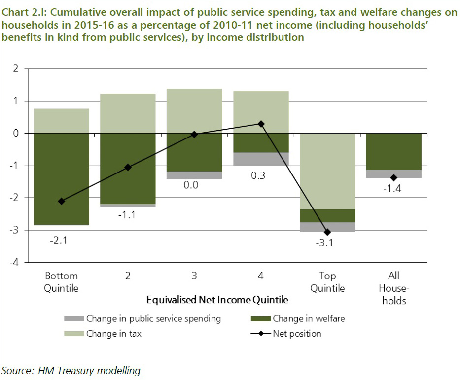
What about public services?
It’s not just changes to your personal income that affect your wellbeing. What about all those cuts to public services?
Here we have to rely on government figures, which as we have seen can be conservative.
For what it’s worth, the Treasury estimates that, if you include cuts to spending on services, top earners still lose out the most, with the bottom fifth the next hardest hit.
What would Labour have done?
One of the most important questions to bear in mind – and one of the hardest to answer. It only makes sense to get angry with the coalition if another government would have done things differently.
The IFS puts it like this: “Some takeaway from households’ incomes was almost certainly inevitable given the need to correct the fiscal deficit that the government inherited.
“The previous government had already announced a number of tax rises to take effect over this period… and it is likely that any government who had taken office in May 2010 would have sought to introduce additional deficit reduction measures.”
And we don’t know what would have happened to real wages if a Labour government had been in charge.


