Barack Obama has called rising inequality “the defining challenge of our time”. Christine Lagarde of the IMF says it casts a “dark shadow” across the global economy.
Russell Brand says… oh, never mind. But it’s clear that the apparently growing gap between the world’s richest and poorest citizens is a big issue.
This week Oxfam launched a new report quoting staggering statistics about the extent to which a tiny rich minority are squatting on a vastly disproportionate share of the world’s wealth.
The report prompted a lot of publicity for Oxfam, as well as attacks from critics who said the charity’s numbers were dodgy. Who’s right?
The analysis
Oxfam relies on research published by Credit Suisse by a team of academics headed by Professor Anthony Shorrocks, a leading expert on inequality.
One headline-grabbing figure promoted by Oxfam is that the combined wealth of the world’s 80 richest individuals is the same as that owned by the bottom 50 per cent of the global population.
It’s numerically true, but as a number of commentators have pointed out, comparing the net wealth of rich and poor can produce some crazy results.
This is because we are defining net wealth here as all the assets that a person owns (like property, shares, pension funds) minus their debts.
So a farm worker in China who has savings worth £10 and no debts is considered wealthier than someone in a western country who is paying off student loans, a mortgage and so on.
Of course it’s not really fair to consider the labourer as “richer”. He doesn’t have any debt because he doesn’t have access to credit – banks won’t lend to him.
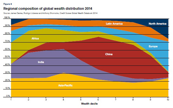
This phenomenon produces some strange results, like the income distribution graph from Credit Suisse which suggests that the United States is home to a significant number of the very poorest people in the world (that little dark blue triangle in the top left hand corner), while China has none.

The academics who produced the report actually specifically advise against making comparisons with the wealth of the bottom half of the distribution, or the poorest 10 per cent, for precisely this reason.
In Denmark, for example, average wealth is negative for the lowest 30 per cent, which makes the country sound tremendously poor and unequal.
But in reality this simply reflects the easy availability of credit, particularly student loans, and perhaps the fact that many Danes are confident about earning enough to be able to pay off their debts later on in life.
Clearly, Oxfam has ignored this advice in its report. Does that blow all the charity’s findings out of the water?
Not quite. There is some evidence in the Credit Suisse paper for rising wealth inequality, particularly since the global financial crisis.
The researchers found that the top 1 per cent owned 48.2 per cent of global wealth in 2014, up from 44.7 per cent in 2007. But inequality had been falling in the years before the crash, so the 2014 percentage is only the highest since 2001.
http://static.data.c4news.com/yKw9q/index.html
Oxfam’s prediction that the richest 1 per cent’s share of wealth will top 50 per cent in 2016 is simply an extrapolation of the short-term upward trend. There isn’t much to say about it other than that it may or may not happen.
Wealth inequality has not risen everywhere around the world, according to this research. It is rising fastest in China, and is flat or falling in many developed western economies.
Of the G7 club of leading economies, Britain is the only country where wealth inequality rose during the entire period from 2000 to 2014, with the top 1 per cent’s share of total wealth rising from 20.5 to 23.3 per cent.
Most countries saw inequality fall slightly prior to 2007 then come back up afterwards, perhaps reflecting the strong recovery of the value of financial assets after the recession.
In the long term, inequality in the US – where the best data is available – was on a downward path from the 1920s to the 1970s before rising from about 1980. This was true of wealth and income (which includes salaries, dividends and pension income) and there was a similar pattern in a number of developed countries including the UK.
This U-shaped trend will be familiar to readers of economists like Thomas Piketty and Emmanuel Saez, who also say income inequality has been rising across the UK, Britain and other English-speaking countries since the early 1980s.
A number of commentators have criticised research like this for looking at people’s incomes without taking taxes and benefits into account – in other words, for neglecting to mention how governments intervene to try to iron out inequality by redistributing money between the richest and poorest.
UK figures which do adjust for taxes and transfers are available from the Institute for Fiscal Studies. Here the IFS uses the Gini coefficient, a measure of inequality ranging from 0 to 1 where a higher number means more inequality.
It’s clear that income inequality did rise during the 1980s, but has fluctuated since about 1990, and may even have fallen slightly in very recent years. The latest figures show a lower Gini number for 2012/13 than in 2009/10, something David Cameron has been at pains to point out.
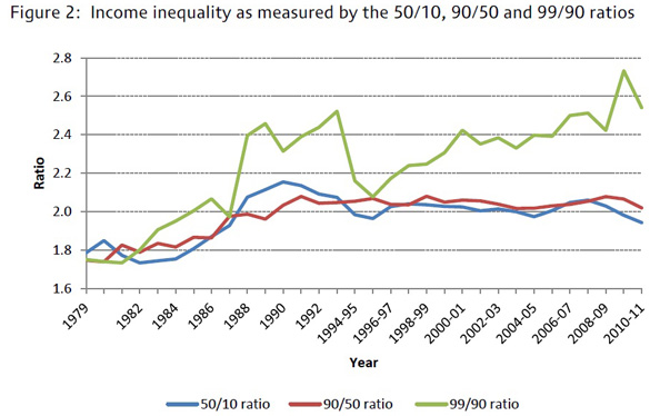
But when the author, Jonathan Cribb, looked closer at the figures, he found an interesting pattern: most of the growth in inequality is as the very top of the income distribution.
Compare the income of someone earning more than 90 per cent of the population to a middle earner. The ratio has hardly changed from the 1990s (that’s the red line here). But the earnings of the top 1 per cent have raced away from the top 10 per cent (the green line).
And if we drill down into the earnings of the top 1 per cent, the richest 0.1 per cent are seeing their incomes grow the fastest.
Why has inequality risen?
Nobody knows for sure. Various suggested culprits range from globalisation (which might depress wages for unskilled workers), technology (which might increase wages for highly educated workers), government policy (tax cuts for the rich in the 1980s), and a growing international market for “superstars” who command astronomical wages.
Does it matter?
The big question here is whether we can live with growing inequality if we are getting growth across the board, which lifts living standards for everyone.
In other words, does this have to be a zero-sum game? If the super-rich are getting richer, does it have to be at the expense of the poor, or can the pie get bigger for everyone?
There’s no dispute that in the long term, in most of the world, average incomes have risen, lifting many people out of absolute poverty.
Economists at the World Bank have shown that the incomes of the poorest people automatically go up in line with average incomes, suggesting that overall economic growth is key in reducing absolute poverty.
IFS data shows how the gap may have widened since the 1960s, but average earnings have still gone up in absolute terms.
http://static.data.c4news.com/VcqjX/index.html
There are two main comebacks to this. Some economists think high inequality can act as a brake on growth – so average incomes might have been even higher if we had managed the gap between rich and poor better.
The fact that median incomes in Britain and America have fallen in recent years provides some ammunition for this.
Others argue that absolute income is not the main driver of happiness. In their 2009 book The Spirit Level, Richard Wilkinson and Kate Pickett put forward the theory that inequality itself was the cause of a host of social problems, regardless of absolute levels of income.
A poor man in Switzerland might earn more than an upper-middle class man in Portugal, but his perception of being at the bottom of the pecking order would make him stressed and unhappy.
The verdict
It’s not surprising that the figures quoted by Oxfam are raising eyebrows. At first glance, they are shocking, although it has to be said that Oxfam’s take on inequality does not quite reflect the nuances of the underlying data.
The Credit Suisse report it draws on specifically cautions against comparing the wealth of the richest with the assets of the poorest, for the good reason that adding up people’s debts can paint an unrealistic picture of the world.
The analysis does suggest that wealth inequality is rising globally and in Britain in particular. But when we allow for taxes and benefits it seems that income inequality has been fairly flat in Britain since the crisis.
In fact, as the coalition has been at pains to point out, the Gini coefficient has actually fallen in this parliament, suggesting that income inequality may not be as urgent a problem in the UK as you might think.
Increasingly, researchers are finding that it’s not the top 10 per cent or even 1 per cent of earners who are seeing their earnings grow the quickest it’s the 0.1 per cent.
This suggests that it isn’t necessarily the rich who are winning the inequality game – or even the super-rich – but the super-mega-ultra-hyper rich.


